New Finteza report for e-Commerce: Customer attraction and retention metrics
Πηγές μάρκετινγκ
As promised, we continue the development of e-Commerce reports. The newly added section is called First-time Purchase. It shows how effectively you attract and retain customers.
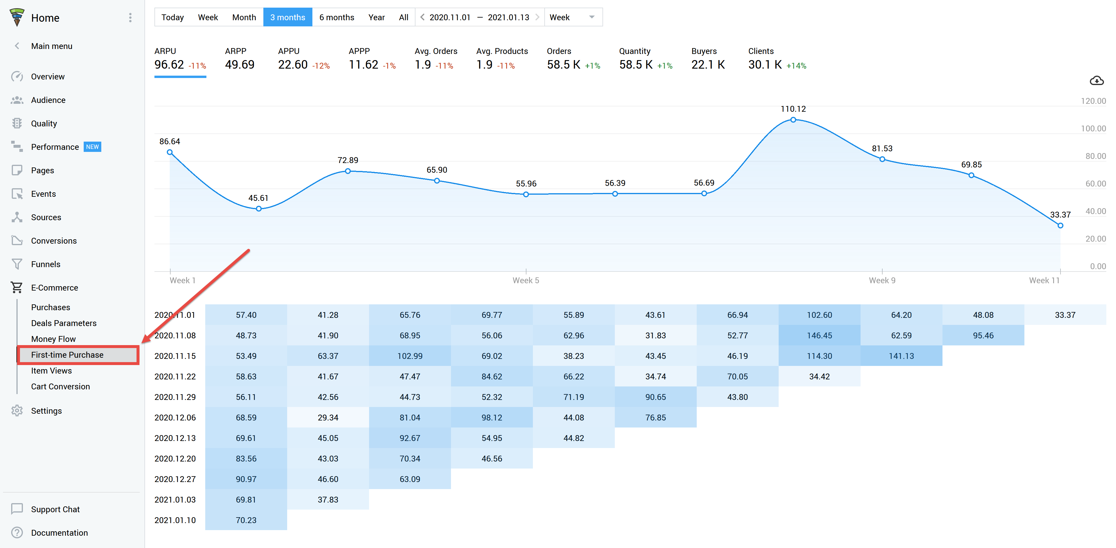
Seasonality sales are over and you wish to compare seasonal results with usual figures? Or you need to find out how your customers behaved — did they pay right away or postponed the deal for a month? What happened to them afterwards — did they return for a second purchase or disappeared? The First-time Purchase section can help you to build relationships with clients, detect strong and weak points of your marketing, as well as look for new interaction patterns which will generate profit.
How to use the report
First-time Purchase section stores data on deals, average spending, prices and other business indicators for the required period. The starting point for all reports is the user's first visit to your website. This means you can evaluate the behavior of visitors depending on the date of the first visit. Among other performance factors, this may help you to evaluate the results of a promotional event or of a loyalty program in the long term.
The reports consist of two parts. The first one is a summary graph, while the second part represents a detailed table of target actions or values by day, week or month.
For example, let's take a period of 10 days (you can choose any period you need).

The graph shows that most purchases occur either on the day of the first visit, or on the next day. By the end of the second week, the number of sales drops to zero. This is quite normal if you sell a niche product (for example, software for designers) or your product has a long lifespan (like a smartphone). People do not buy phones every day, so there is no point in waiting for repetitive purchases any time soon. However, if you sell food or expendables, like paper towels, such a graph looks alarming: you are clearly losing customers and have to figure out why.
The second part of the report shows the number of buyers by day since the first visit. You are able to switch to weeks or months if necessary.

Of those who first visited the website on July 6, 62 people made purchases on the very first day. The next day saw another 40 purchases (these are not necessarily the same people, since some could have left on the first day without buying). 14 more people, who first visited the site on July 6, made their purchases only on the third day.
40 people returning one day later is the highest value for the period. Where did such returns come from? For instance, the marketing department may have experimented with a catch-up email — everyone who did not finish the purchase on July 6, received an email reminder the day after. This action has worked well, which means you can use it on an ongoing basis.
Orders
This section allows you to control the number of orders and define how many transactions a customer made during a certain period. This time we have generated a report for 5 months and have split it by months.
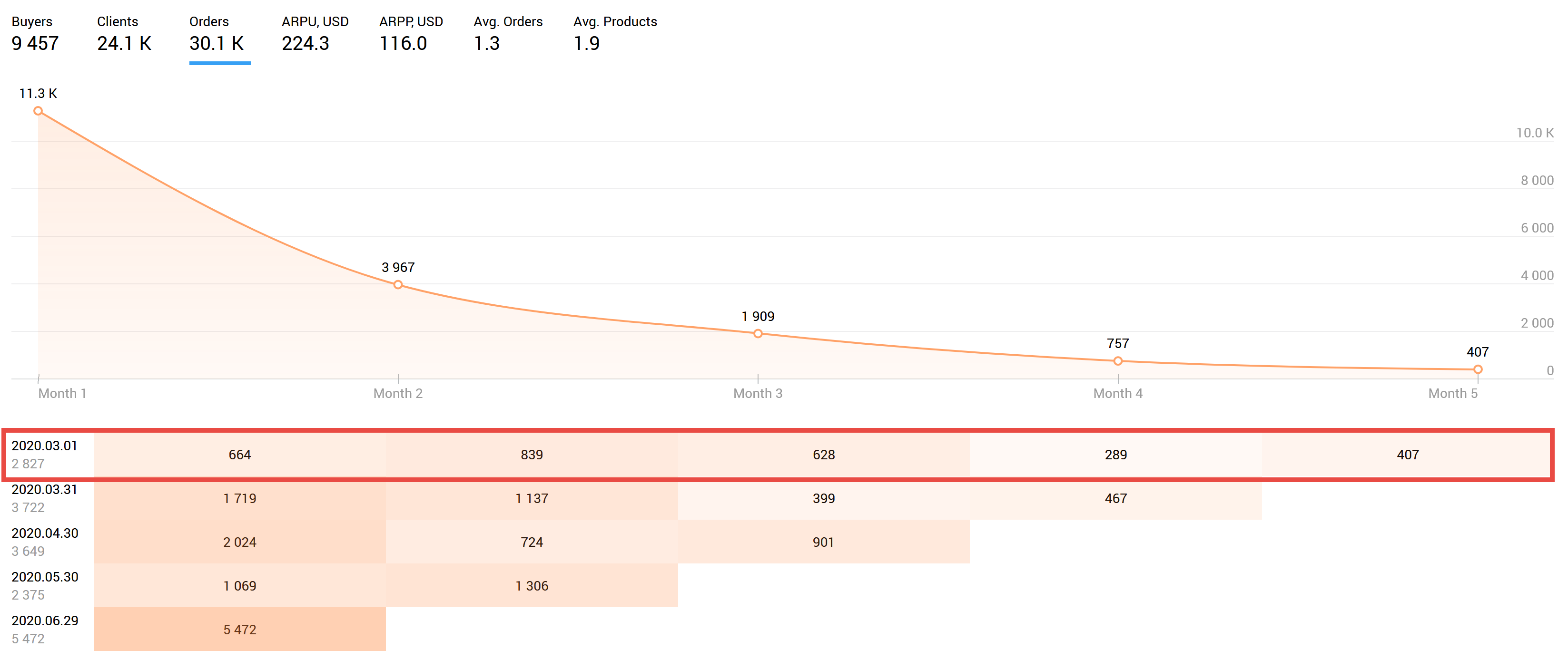
Now the table line stands for the period from March 1 to March 31, rather than a specific day of the first visit. We can see that those who first visited the website in March made 2,827 deals. However, these purchases are far from regular — the number of deals decreases over time. The clients are leaving. If we want to retain customers, the numbers should be approximately the same for all months. If we strive to increase customer loyalty, the numbers in the table should grow: loyal customers will buy more often if your business allows that.
What useful information can we actually obtain from this report? Suppose that the graph belongs to an online houseware store. Obviously, sales managers try to persuade customers to buy something in the first or second month, so the numbers are good at first. But the fourth month (when the time comes for many clients to restock) sees a huge downfall — only about 300 transactions in total. It would be difficult to track such dynamics in the general flow of customers. This report allows us to immediately detect the problem and start looking for its causes — perhaps the managers are not in touch with the customers, or we are let down by the slow delivery service.
Or it is all much simpler — the first deals were trial ones. This is why they are so numerous. During the fourth month, customers place large orders. The next report — Average revenue per user — allows us to determine whether our conclusion is correct.
ARPU (Average revenue per user)
This section reveals how much money the average customer spends per deal. The graph shows the average value of the total number of buyers and deals for each day after the first visit. In our example, the average deal on the fourth day after the first visit is USD 33.
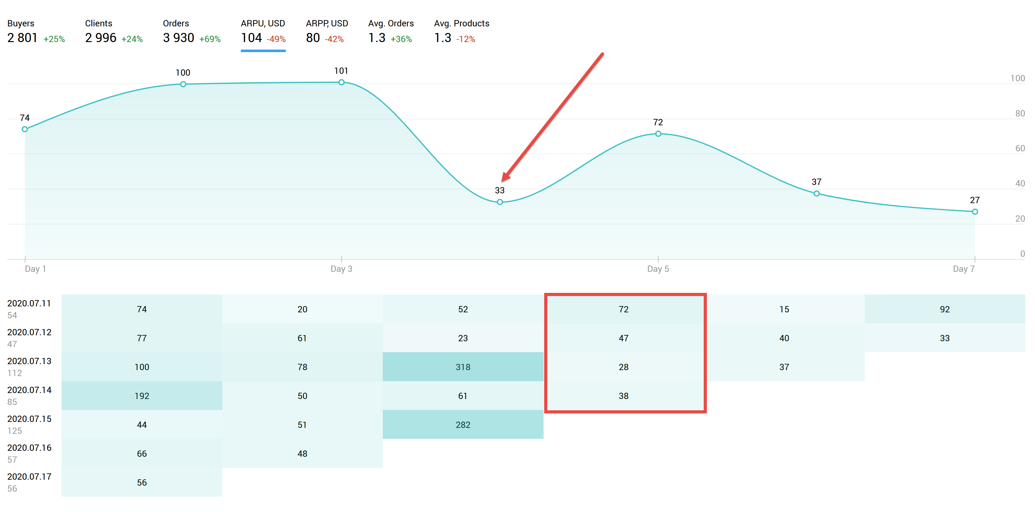
However, if we look at the details of the fourth day in the table, we can see that those who first visited the website on July 11 spent an average of USD 72, four days later. Those who first visited the site on July 13 spent only USD 28. This data may be useful when monitoring marketing campaign results. The report also allows assessing whether new customers you attracted on a particular day are eager to spend their money.
ARPP (Average revenue per product)
This report shows the average price of one product, allowing us to evaluate the cost of goods sold. Suppose that we applied a 30% discount on some positions to attract new customers on April 28. ARPP is able to define how this event affected buyers. Perhaps, they just bought a cheap product and vanished without ever returning.
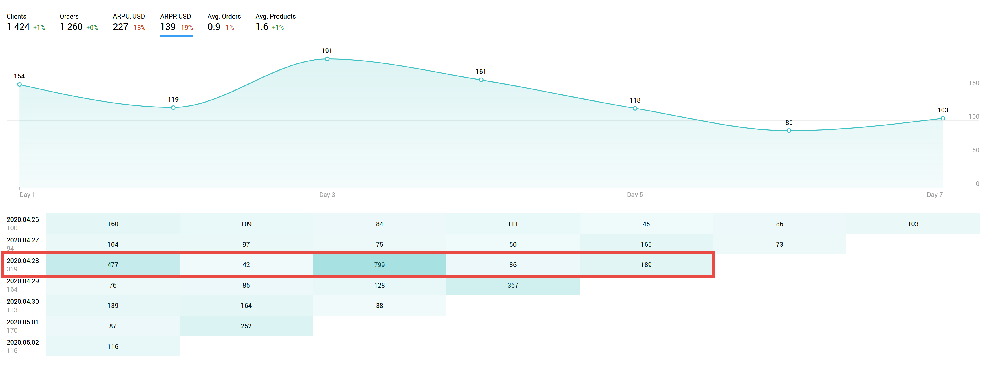
It would seem that the average value of a position should fall that day since we cut the prices. However, apart from discounted goods, the new visitors also bought some other products at their usual prices. This is why the figures on April 28 are even higher than usual. On the third day (April 30), those who first visited the site on the day of the promotion bought even more expensive goods. Note that those who first visited the site on April 30 purchased much cheaper positions: USD 139 versus USD 799. Apparently, the event can be considered successful.
Avg Orders (Average Orders)
This report shows how many deals were made by buyers within a certain period. As an example, we have split the three-month report into weeks.
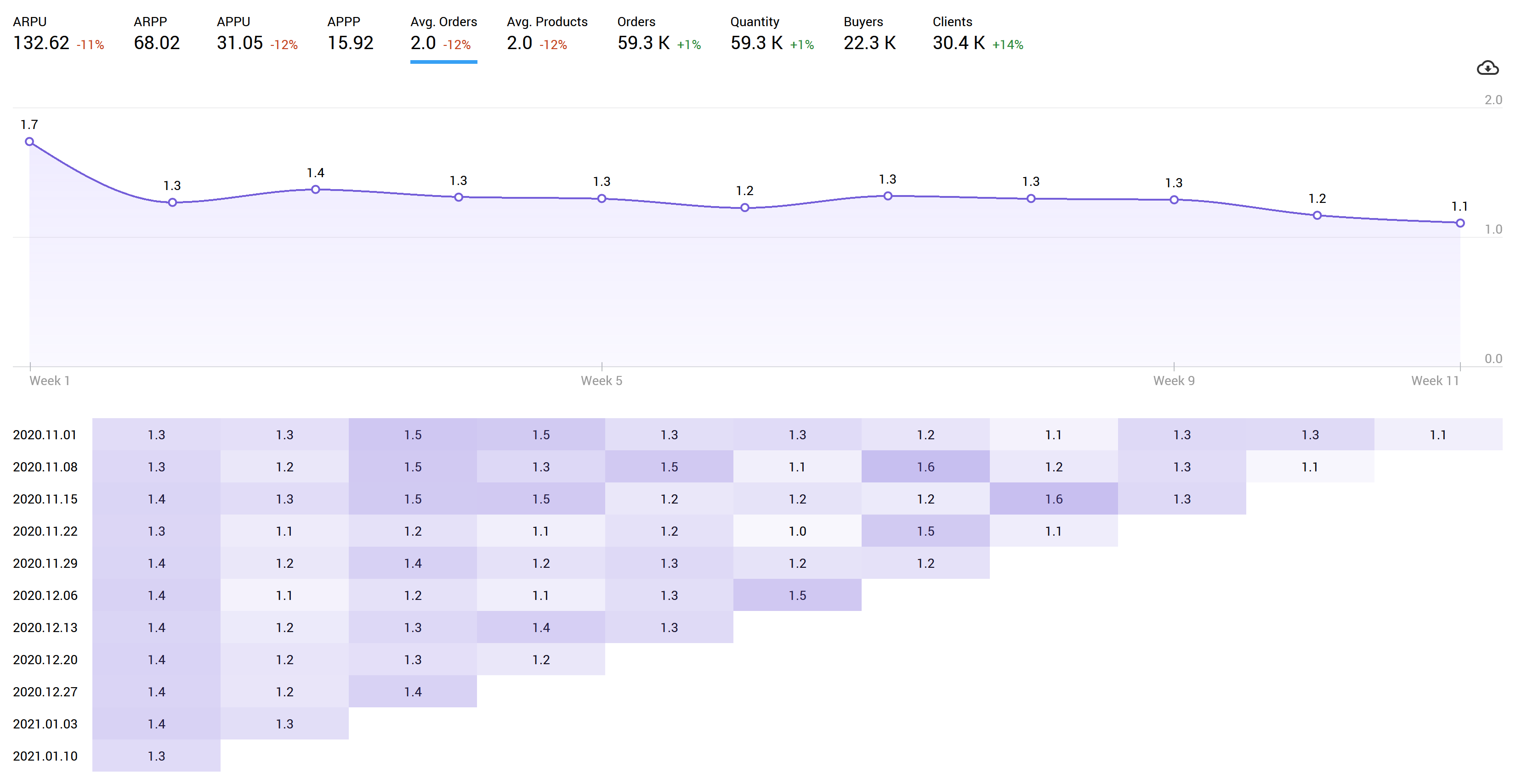
Here we can see that customers are most active at the very beginning, making an average of 1.7 orders in the first week. The overall situation remains generally optimistic — even those who visited the website 2 months ago buy more than once. But by the end of the third month, the graph gradually begins to decline approaching 1 (it is not possible to buy less than once). This suggests that we should encourage buying activity at least once every three months to prevent a decline. If we want to achieve the highest possible results, we should display activity every week: it is time to think about promotions, discounts and advertising emails.
This report should also be combined with ARPU data — perhaps, the average order amount grows over time, and the decline we noticed on the graph will not affect our profit in any way. In addition, the orders themselves can become larger — for example, customers no longer order products in smaller batches, but instead they collect everything they need into one large order. If this is the case, the number of deals in Avg Orders report decreases, while the values in Avg Products report increase.
Avg Products (Average Products)
This report shows how many products are included in one purchase, on average. If you sell only one product type (for example, software), the value will stay at one since it has nowhere to grow or fall. In case of a grocery store or clothing store, the number of positions may greatly vary.
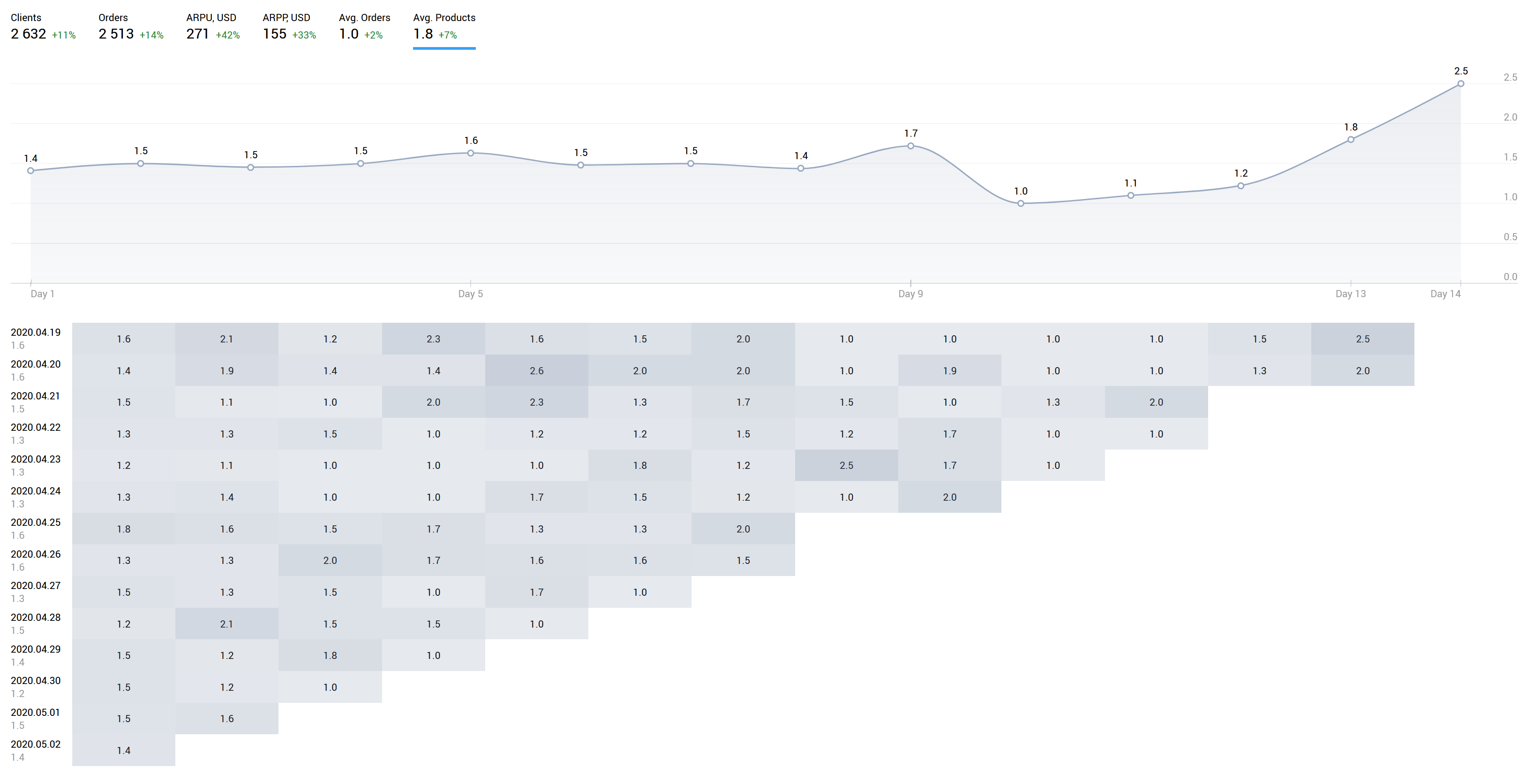
Suppose that we want to test a special offer in our online clothing store: a discount of 20% for the second item and 50% for the third one. Avg Products allows us to see how many goods were bought on average by those who visited the website on the promotion day. The report shows how the average number of items purchased has changed. Combined with other reports in the section (like ARPU), you can comprehensively assess how the promotion affected sales and customer visitation on that day.
Try the new section for free
Do not take every report in the First-time Purchase section as a basis for decisive actions. The main strength of Finteza is comprehensive analytics which show the whole picture and help you choose a further development direction. For example, your average check decreased, but at the same time you received enough new loyal customers to remain in the black. Perhaps you received huge traffic from an expensive advertising campaign which brought only one-time deals rather than regular customers. Use all Finteza features to evaluate the situation from every perspective and make the right decision. Insert Finteza code to your website, connect e-Commerce reports and develop your business with our analytics.

