Applying A/B tests in Finteza for testing marketing hypotheses
마케팅 리소스
It is difficult to overestimate the importance of A/B tests in constant struggle to increase conversion rates, although it is quite easy to underestimate it. Let's consider our own case.
Our community of traders on MQL5.com features the largest market of trading robots and technical indicators for MetaTrader. With more than 18,000 applications and hundreds of daily purchases, it is in a pretty decent shape but we always want to make it even better, more convenient and more profitable.
We studied several conversion optimization cases, checked the largest online markets and noticed an interesting feature. Most major online stores set product information on the left and purchase buttons on the right. After digging a bit deeper, we found out that the reason for that lies in statistics. About 85% of the world's population is right-handed, and it is more convenient for them to consume information in this form. In contrast to that trend, our market of trading applications features purchase buttons on the left side.
It is now difficult to say why this happened. Most likely, we tried to maintain consistency with the MetaTrader 4 and MetaTrader 5 desktop terminals.
As a result, we came up with the hypothesis: if we move the Buy button to the right, users will click on it more often. More clicks mean more purchases. After all, why would we go against 85% of the world's population?
However, before making any hasty decision, we conducted an A/B test to find out whether the frequency of clicks (and the number of purchases) depends on the location of the buttons.
Here is what we did:
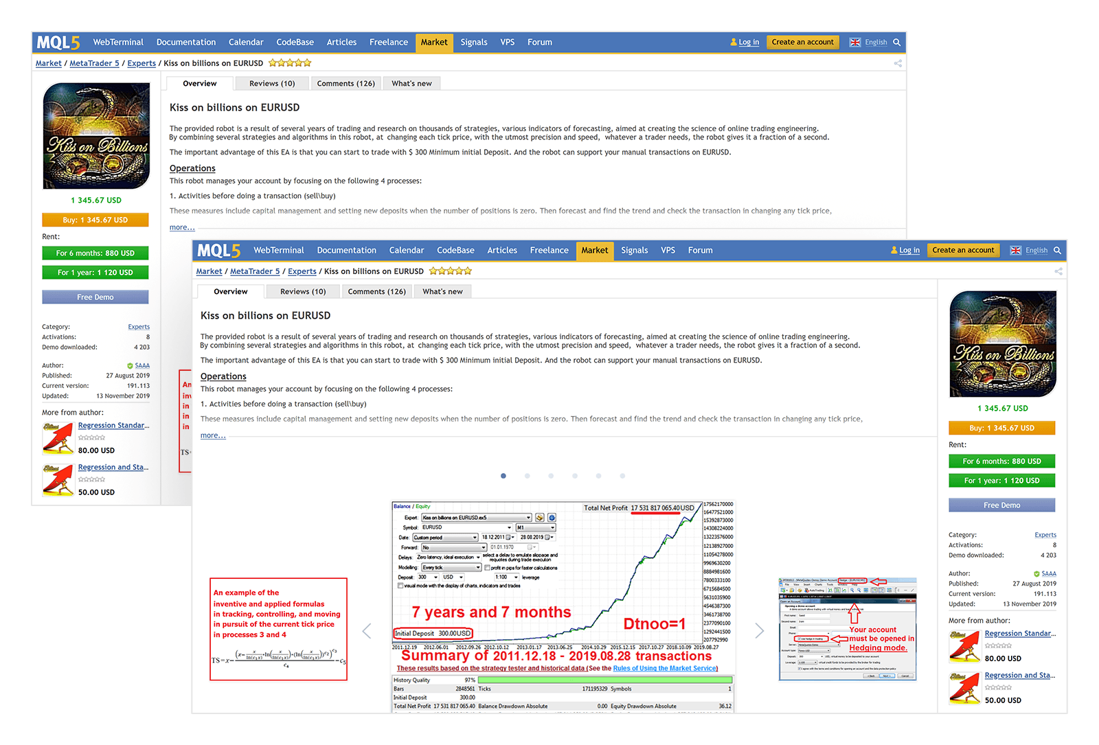
1. We have prepared a version of the page with the right-side buttons. Below you can see both versions:

This may not be the best solution, but looking for an impeccably perfect option takes a lot of time, effort and money. All we wanted to do was test the change, measure its efficiency, draw conclusions and make a decision in a timely manner.
2. The two web page versions are ready. Now we need to separate the website audience. Some users should see the Buy button on the left, while others should see it on the right. Web developers have implemented the following algorithm.
The last digit of the user's unique cookie is analyzed:
- If it is even, the buttons are displayed on the right
- If it is odd, the buttons are displayed on the left
The advantages of this approach:
- We can show the same button layout for each user as long as that user has a unique cookie
- This works for both authorized and non-authorized users
- A unique cookie does not change after authorization
3. Now that the audience is separated, we only need to add tracks to measure the results.
For more integrity, we have introduced three types of events in Finteza:
| № | Action | Left-side button event | Right-side button event |
|---|---|---|---|
| 1 | Displaying the product page | MQL5 Market Product View Left | MQL5 Market Product View Right |
| 2 | Clicking Buy or Rent | MQL5 Market Product Buy Left | MQL5 Market Product Buy Right |
| 3 | Successful completion of a purchase | MQL5 Market Product Buy Finish Left | MQL5 Market Product Buy Finish Right |
All preparations have been made. It is time to launch the A/B test!
After starting the test, we noticed an interesting thing. The page with the right-side buttons was displayed more often. Even the random nature of the process does not guarantee an audience distribution of exactly 50/50. In our test, it turned out that 44% of users see buttons on the left and 56% - on the right. However, this did not affect the verification of our hypothesis, since we considered conversion rates in percentage terms.
The A/B test was completed after 2 weeks. To determine the efficiency of the change, we used the funnels – a convenient tool of the Finteza analytical system.
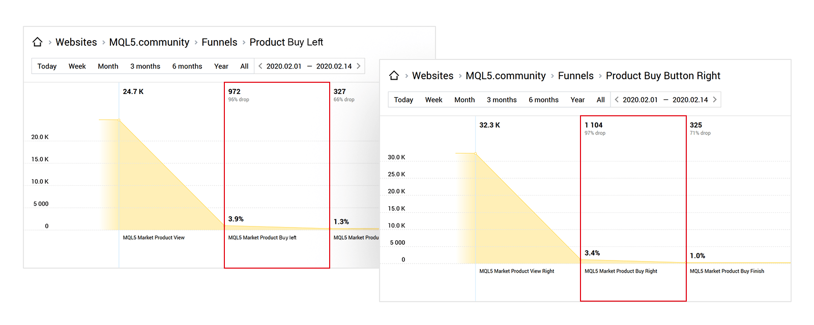
We built funnels consisting of three stages for each version of the page. Our hypothesis states that changing the location of the buttons should increase the click-through ratio. In other words, the stage between displaying the web page and clicking the button should be affected most. We have marked it with the red frame.

As we can see, the conversion rates of clicks on left- and right-side buttons are almost indistinguishable. The conversion rate even turned out to be 0.5% higher for the left-side button. This means our hypothesis was not confirmed.
We do not claim that left-side buttons work better than right-side ones. We only show that each case is highly specific. Before introducing any fundamental changes, they should be tested to make sure they are based on solid numbers rather than wishful thinking. Finteza can help you with that.
Conclusions:- It is important to constantly work on increasing conversion rates so that you can attract traders more efficiently, optimize registration forms, get more profit and protect your company from incorrect decisions.
- Finteza provides all the necessary tools to measure the efficiency of your changes.


